Mistakes to Avoid When Designing Signage for Your Business
Business signage creates the first impression customers have
of your company before they even walk through your door. Many business owners
make costly mistakes that hurt their professional image and waste their
advertising budget. Smart planning and avoiding common errors can make your signage
work harder to attract customers and build trust in your brand.
Using Too Many Words on Your Sign
One of the biggest mistakes businesses make is cramming too
much information onto their signs. People walking or driving by your business
only have a few seconds to read your sign. If there are too many words, they
will not read any of it and might not even remember your business name.
Your main sign should focus on these essential elements:
- Business
name: Make this the largest and most prominent text
- What
you do: A simple description like "Pizza Restaurant" or
"Auto Repair"
- Contact
information: Phone number or website address
- Nothing
else: Extra details belong on smaller signs or inside your store
A restaurant sign should say "Mario's Pizza" with
a phone number, not list every ingredient they use or every special offer they
have.
Many successful signage services in Dubai recommend the
"five-second rule" for outdoor signs. If someone cannot read and
understand your sign in five seconds or less, it has too many words. Keep your
message short and simple so people can quickly understand what your business
offers.
Choosing Colors That Are Hard to Read
Color combinations that look nice on a computer screen might
be impossible to read on an actual sign. Light yellow text on a white
background looks pretty but disappears completely when viewed from a distance.
Dark blue text on a black background creates the same problem.
The best high-contrast color combinations for business signs
include:
- Black
text on white background: Classic and always readable
- White
text on dark blue background: Professional and trustworthy appearance
- Yellow
text on black background: High visibility, especially at night
- Dark
blue text on light gray background: Modern and easy on the eyes
Colors to avoid for readability:
- Light
yellow on white - disappears completely from a distance
- Dark
blue on black - creates poor contrast
- Red
on green - difficult for colorblind people to distinguish
- Orange
on red - colors compete and strain the eyes
Consider how your sign will look in different lighting
conditions. A sign that is easy to read in bright sunlight might be hard to see
at dusk or under street lights. Test your color combinations by printing them
on paper and looking at them from far away in different types of light.
Making Text Too Small to Read from a Distance
Business owners often underestimate how big their text needs
to be for people to read it easily. A sign that looks perfect when you are
standing right in front of it might be completely unreadable from across the
street or from a moving car.
Text size guidelines for different viewing distances:
- 20
feet away: Text should be at least 2 inches tall
- 50
feet away: Text should be at least 5 inches tall
- 100
feet away: Text should be at least 10 inches tall
- 200
feet away: Text should be at least 20 inches tall
Your business name should be the largest text on the sign,
followed by what you do, then your contact information. Consider the viewing
angle as well as distance. People looking up at a high sign or down at a
ground-level sign need larger text to read clearly. Professional designers
account for these viewing angles when planning text sizes for different types
of signs.
Using Fonts That Are Impossible to Read
Fancy, decorative fonts might look artistic, but they often
make your business name impossible to read quickly. Script fonts, decorative
fonts, and fonts with thin lines become blurry and hard to read on actual
signs, especially from a distance.
Best font choices for business signage:
- Sans-serif
fonts (Arial, Helvetica): Clean, modern, and highly readable from a
distance
- Bold
versions of simple fonts: Stand out better than thin or light font
weights
- Fonts
with wide letter spacing: Easier to read when viewed quickly or from
far away
Fonts to avoid for main signage text:
- Script
or cursive fonts: Look elegant but become blurry and hard to read on
signs
- Decorative
or artistic fonts: May look creative but sacrifice readability
- Thin
or light weight fonts: Disappear when viewed from a distance
- Fonts
with very small details: Fine lines get lost in manufacturing and
viewing
Forgetting About Lighting and Weather Conditions
Weather and lighting considerations for outdoor signs:
- Rain
and moisture protection: Use waterproof materials and sealed edges to
prevent damage
- UV
protection: Choose fade-resistant materials for sunny climates
- Wind
resistance: Ensure proper mounting and structural support for strong
winds
- Night
visibility: Plan for adequate lighting so customers can read your sign
after dark
Signs that work well in perfect conditions might become
invisible during bad weather. In very sunny areas, use UV-resistant materials
to prevent fading. In rainy areas, ensure your sign materials will not warp or
deteriorate from moisture.
Your sign should be lit well enough for customers to read
your business name and understand what you do. Poor lighting makes your
business look closed or unprofessional even when you are open for business.
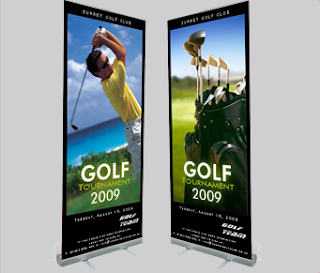
Overcrowding Signs with Graphics and Images
While pictures can help explain what your business does, too
many graphics make signs look cluttered and confusing. Some business owners try
to show everything their company offers through pictures, creating signs that
are overwhelming and hard to understand.
Choose one or two simple graphics that clearly represent
your business. A dentist might use a tooth symbol, a restaurant might show a
simple food image, and an auto repair shop might use a wrench icon. These
graphics should support your text, not replace it or compete with it for attention.
Make sure any graphics you use are large enough to see
clearly from a distance. Small, detailed pictures become meaningless blobs when
viewed from far away. Simple, bold graphics work much better than complex,
detailed images for business signage.
Failing to Consider Local Regulations and Permits
Important regulations to check before ordering your sign:
- Local
government rules: Size limits, height restrictions, and permit
requirements
- Historic
district regulations: Special rules for maintaining architectural
styles
- Building
management policies: Landlord restrictions on tenant signage
- Safety
and accessibility codes: Requirements for emergency access and
visibility
Some areas require permits before installation, while others
have restrictions on sign types, colors, or sizes. If you lease your business
space, check your rental agreement for any restrictions on exterior signage
before making final plans.
Getting approval first prevents costly changes later and
protects your security deposit. Research these rules early in your planning
process so you do not waste time and money on a sign you cannot use.
Rushing the Design Process Without Testing
Excitement about opening a new business or updating an
existing one can lead to rushed signage decisions. Many business owners approve
sign designs without taking time to consider how they will work in real-world
conditions.
Simple steps to test your sign design before ordering:
- Print
and post: Print your design on paper and tape it where your real sign
will go
- Check
multiple distances: View it from close up, across the street, and from
a moving car
- Test
different times: Look at it in morning sun, afternoon shade, and
evening light
- Get
feedback: Ask friends, family, and potential customers if they can
read it easily
- Take
photos: Pictures often reveal problems that your eyes miss in person
This simple testing process reveals problems before you
spend money on the final sign. You might discover that your chosen colors do
not work well together, your text is too small, or your design does not stand
out against your building's background.
Making Signs Without Professional Consultation
While it might seem like a way to save money, designing
business signage without professional help often leads to expensive mistakes
and poor results. Experienced sign professionals understand local regulations,
material options, and design principles that most business owners do not know.
Professional signage services in Dubai and other locations
offer consultations that can prevent costly errors and ensure your signs work
effectively for your business. They understand which materials work best in
different climates, how to design for maximum visibility, and what permits
might be required.
The cost of professional consultation is usually much less
than the cost of fixing mistakes or replacing signs that do not work properly.
Good professionals also offer warranties and ongoing support that protect your
investment.
Conclusion


Comments
Post a Comment